Calculation of the reentry date

The reentry date is calculated with a Monte Carlo simulation that includes the Newtonian and the relativistic accelerations of all the planets, Sun and Moon.
The Earth's gravity field is modeled with the SGG-UGM-1 gravity model (computed using EGM2008 derived gravity anomaly and GOCE observation data) truncated to the degree and order 15 (to save the running time, while retaining good accuracy when compared to the full model).
For the calculation of the air density, I use the NRLMSISE-00 model along with an updated data file for the solar and geomagnetic indices.


All the times are given in TT (terrestrial time).
According to IERS Rapid Service/Predictions Centre, the UTC time can be calculated as: UTC = TAI - n, where TAI is the International Atomic Time and n is the cumulative number of leap seconds.
Given TT, TAI = TT - 32.184 s (see here).


The Monte Carlo simulation is as follows:

1) with one TLE and the SGP4 propagator calculate the initial state (position and velocity) of the satellite for the TLE epoch;
2) propagate that initial state with a specially crafted propagator (my propagator is based on the DOPRI853 integrator);
3) when the satellite altitude drops below a given value (usually 80 km), stop the simulation; this is the reentry date (this date is shown with a blue dot in the graphs);
4) for N times do the following:
4a) add a random offset (with a properly chosen distribution) to both the position and the velocity to take into account the uncertainty on the initial state;
4b) propagate the modified initial state as in the step #2;
4c) as per step #3, but this time the color of the dots is gray.

If I use the newest 10 TLEs and the N at the step #4 is 50, the graph will show 10 blue dots and 500 (50 x 10) gray dots.
The graph is formed by two parts:

1) Plot of the reentry dates
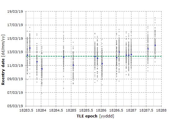
The horizontal axis shows the epoch of the TLEs used for the calculation of the satellite initial state and the vertical axis shows the reentry dates obtained by propagating the initial state.
The dashed green line represents the average of all the dates (gray and blue dots).

2) Distribution of the reentry dates
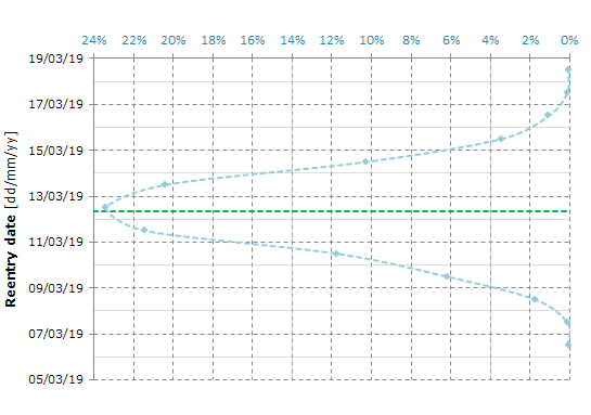
This additional plot helps in finding how many dates lie in a given interval.
The horizontal axis in the upper side of the graph shows the percentage of the dates that lies within a given interval.

The plots that show the heat rate / heat load are calculated with the Sutton-Graves convective heating relation. The formula has been verified against numerous ground-based test and flight programs and it is generally accurate for blunt bodies to within 5-10%. Note, however, that only a small fraction of this thermal energy is transferred to the satellite; near peak heating, 1% to 5% of the total thermal energy is transferred to the satellite surface.
The heat load is calculated by integrating the heat rate over the time.
For reference, the Apollo command module entering Earth's atmosphere with an airspeed of about 10.8 km/s, experienced a peak heat rate of 400 to 500 W/cm2 and the corresponding stagnation point heat load of about 20 kJ/cm2.